poppy
packaging
illustration
lettering
SKILLS
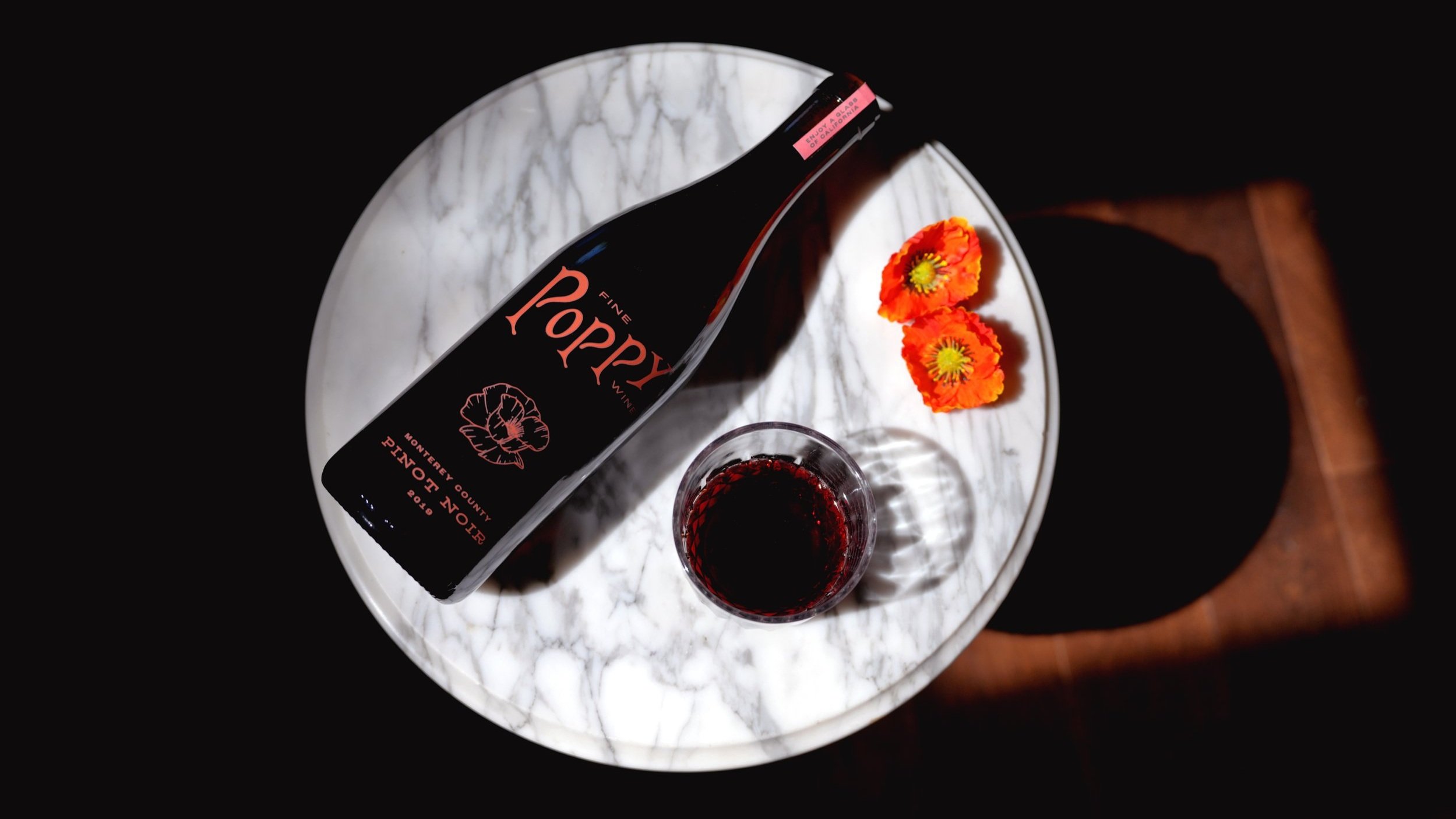
The redesign of California-based winery Poppy was an effort to elevate the experience of purchasing inexpensive wine without looking inexpensive. The proposed new design seeks to honor Poppy’s original tone by remaining sophisticated and classic, while bringing the brand into a modern market. I ultimately wanted to reinforce the notion that a consumer has not just purchased a beverage but an experience—they’ve purchased a “glass of California”.
The logo was the first element to undergo redesign and required multiple iterations, both digitally and on paper. Once I refined the appropriate logo, typography, colors, and imagery, I applied them throughout the design. A magnetic-closure box was purchased as a template for many of these applications; the logo was embroidered, a pattern was made into panels for the sides of the box, and the inside flap of the box included a brief description of the wine bottle with suggested pairings. The box itself also included constructed elements, including floral foam that was carved to the specifications of the bottle and covered in black velvet as a finishing touch. I also created a hang-tag that resembled a packet of plant seeds and actually filled it with culinary poppy seeds, nodding to the namesake of the brand.


